Create Static Billboards People Can Understand in Seconds
A static billboard does not have time to explain everything about your brand. It has a few seconds to be noticed, understood, and remembered while people are driving, moving, or passing through a busy environment.
The strongest billboard designs are not always the busiest or the most detailed. They use one clear message, strong visual hierarchy, readable creative, and a layout built for the real outdoor environment.
If your audience cannot understand the main idea at a glance, the billboard is trying to say too much.
Outdoor creative should make one message feel immediate, not make people work to find it.
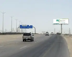
Billboard Design Is Not Social Media Design
A social media post can hold multiple messages because people can stop, scroll, zoom, read captions, and return to it later. A roadside billboard cannot. It is seen from a distance, often at speed, and usually only once during a single journey.
That is why a strong static billboard design should not be treated like a brochure, a website banner, a presentation slide, or a social media layout. The design must work for movement, distance, weather, competing visual distractions, and limited attention.
Before finalising the creative, it also helps to understand the location where it will appear. A billboard on a fast-moving road needs a different level of simplicity from a billboard near a commercial district, destination, or slower traffic environment. Read our guide on
choosing a billboard location in Saudi Arabia
to see how visibility, traffic direction, audience, and campaign objective influence the media decision.
A billboard should answer one question quickly:
what should the audience remember after they pass it?
Start with One Message, Not Five
Most weak billboard creative has the same problem: too many messages compete for attention. A logo, product image, headline, offer, website, QR code, phone number, social handles, several benefits, and small legal text may all be important to the brand team. But they cannot all be equally important to a moving audience.
Select one dominant idea. It may be a brand name, a project launch, a product, a location, a limited offer, or a short memorable statement. Everything else should support that message rather than compete with it.
Make the brand, product, or campaign identity the hero. Avoid over-explaining.
Lead with the project name, a strong visual, a clear location cue, or one meaningful benefit.
Make the offer easy to notice, but keep the words limited and the action simple.
Use the place, experience, or reason to visit as the main visual and message.
Design for Distance, Speed, and Viewing Time
A static billboard is not viewed from the same distance by every person. Some people notice it far away, others only as they approach, and some may see it for a brief moment while driving. Your typography, image scale, logo size, and message length should account for this.
Large, high-contrast words are more likely to be understood than several lines of small text. A powerful image or product visual often works better than multiple small photographs. A clear logo should be visible, but it does not need to dominate every inch of the layout.
The distance test
Before approving artwork, shrink the design on a laptop screen or print it small. If the main message is not immediately clear from a distance, simplify it before it reaches production.
- Can the headline be understood immediately?
- Is there one dominant image or visual element?
- Does the logo remain visible without taking over the layout?
- Would a passing driver understand the core message?
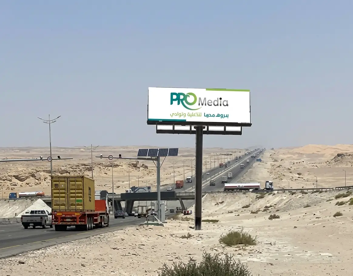
Build a Clear Visual Hierarchy
Visual hierarchy is the order in which people notice the elements of your billboard. The viewer should see the most important part first, understand the supporting idea second, and notice the brand or call to action without searching for it.
| Priority | What the Audience Should Notice | Design Approach |
|---|---|---|
| 1. Main Message | Headline, offer, project, product, or campaign idea | Use the largest scale, strongest contrast, and clearest placement |
| 2. Main Visual | Product, destination, person, project, or visual symbol | Use one strong image instead of several smaller competing images |
| 3. Brand Identity | Logo, brand colour, recognisable style, or tagline | Keep it clear and visible, but do not make it compete with the main message |
| 4. Action Detail | Website, short CTA, QR code, or location cue when relevant | Use only if it supports the campaign and remains readable |
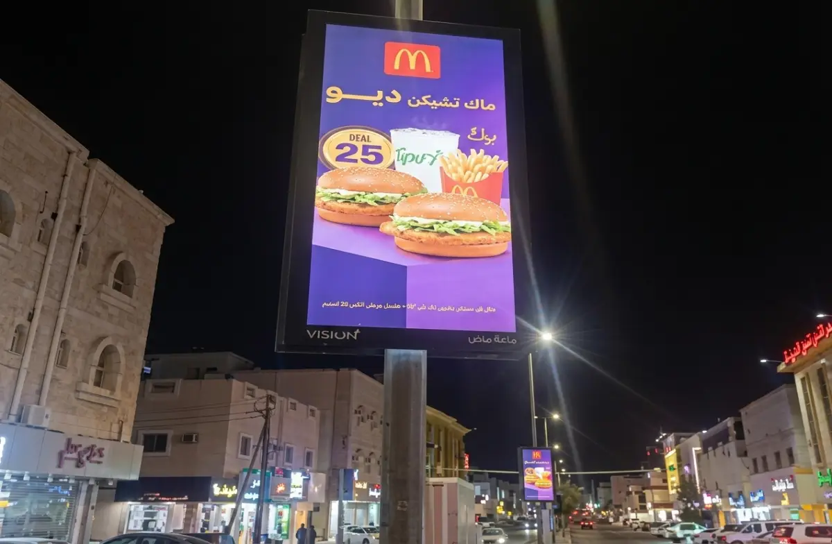
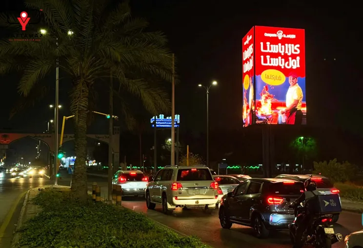
Billboard creative must be planned around the real direction, distance, and speed of the audience.
Use Colours That Work Outdoors
Brand colours are important, but billboard creative needs enough contrast to remain clear under daylight, at sunset, and in different surrounding environments. A colour palette that looks elegant on a phone screen may lose impact from a road if the text and background do not separate clearly.
Use colour to guide the eye toward the main message. Strong contrast between text and background can improve readability. Too many colours, gradients, effects, or visual textures may make the message less clear, especially when combined with small text.
A simple outdoor design principle:
if the background is visually active, simplify the text. If the text is detailed, make the background calmer.
Static Billboard vs Digital Billboard Creative
Static and digital billboards may support the same campaign, but the creative is not prepared in exactly the same way. Static billboard creative is fixed for the campaign period, so every element must work together in one final printed layout. Digital billboard creative may use motion, sequencing, video, changing offers, or multiple screen-ready versions where the media format allows it.
If your campaign is still deciding between both formats, explore our guide to
Digital Billboard vs Static Billboard
.
It explains how campaign objective, content flexibility, duration, and available locations can influence the format choice.
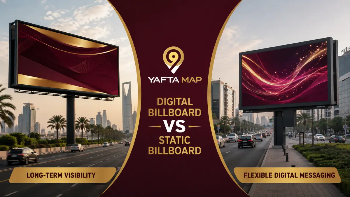
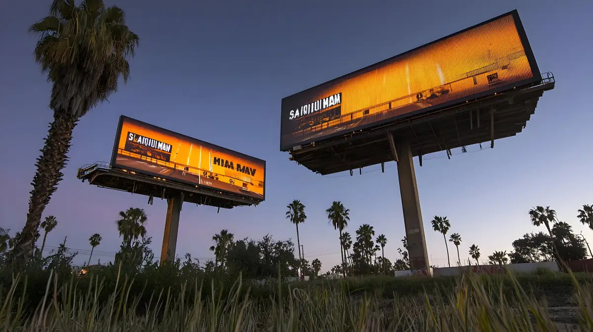
Static and digital billboard formats require creative adapted to their respective media environments.
Let the Location Influence the Design
The creative should not be approved in isolation. The billboard location, audience movement, surrounding visual environment, and campaign role should influence the final design. A message on a high-speed road should be simpler than one in an environment where people have more time to look.
For example, a commercial district may allow a design that supports retail awareness, location cues, or a direct offer. A major roadside billboard may need a larger headline, one strong visual, and less supporting copy. This is why creative planning and media planning should work together rather than as separate steps.
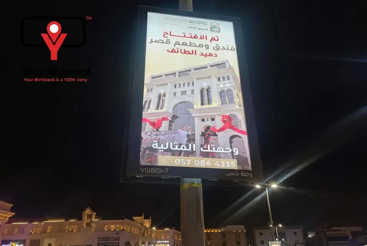
Before designing, confirm:
- The billboard dimensions and orientation
- The approximate viewing distance and traffic direction
- Whether the location is roadside, commercial, retail, or destination-led
- The campaign duration and key message
- The production and installation requirements
Common Static Billboard Design Mistakes
A billboard can have a strong brand, premium product, and excellent location but still lose impact because the design is overloaded or poorly adapted to outdoor viewing. Avoiding a few common mistakes can make the final creative clearer and more effective.
Long paragraphs, several benefits, and multiple small lines are difficult to read from a moving vehicle.
If the main message or brand is too small, the viewer may see the billboard without remembering who it was for.
Text that blends into the background can disappear outdoors, especially in bright daylight.
A billboard needs fewer elements, larger scale, and much stronger visual hierarchy.
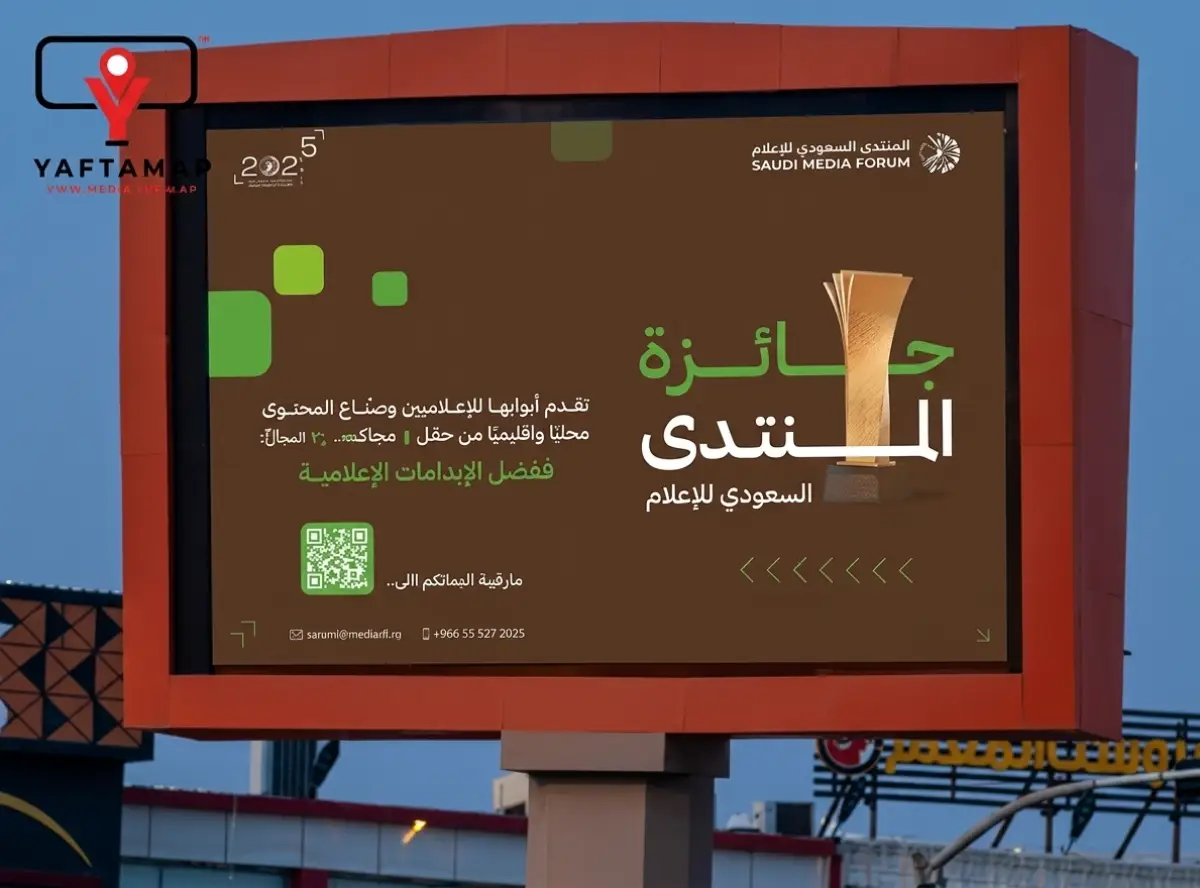
Creative should be adapted to the billboard size, road environment, direction, and viewing conditions.
When action matters, use one simple cue such as a location, short URL, or memorable brand prompt.
Final Artwork Checklist Before Printing
Before artwork is sent to production, review the design as a billboard rather than as a digital file. The final check should protect the campaign from simple but costly issues involving size, readability, visibility, brand consistency, or production readiness.
If the campaign also needs a quotation, location options, or production coordination, read our guide to
billboard advertising costs in Saudi Arabia
.
It explains the factors that affect the campaign budget, including location, format, duration, production needs, and services included.
From Billboard Creative to Campaign Execution
Good billboard creative is part of a wider campaign process. The best result comes when the location, audience, format, design, budget, timeline, production, installation, and monitoring work together from the beginning.
Yafta Map KSA can support brands with
OOH media planning and buying
,
helping you compare locations, formats, campaign timing, and budget allocation. If you need one coordinated team from planning to launch, explore
full campaign management
.
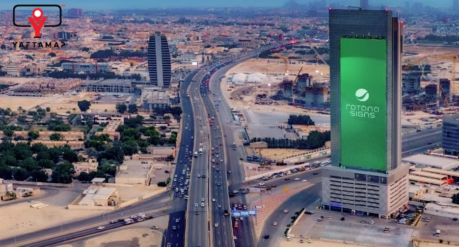
Strong OOH campaigns connect media planning, billboard location, creative design, production, and execution.
Before selecting a partner, it is also useful to understand how to compare providers beyond price alone. Our article on
choosing a billboard advertising company in Saudi Arabia
explains the key questions brands should ask about locations, planning, transparency, creative support, and campaign management.
Frequently Asked Questions
What makes a static billboard design effective?
An effective static billboard has one clear message, strong contrast, readable text, a powerful visual hierarchy, visible brand identity, and creative adapted to the billboard location and viewing distance.
How much text should a static billboard include?
Keep the message as short as possible. A billboard should communicate its main idea at a glance, so use a concise headline, a clear visual, and only the details that truly support the campaign objective.
Can Yafta Map KSA design static billboard creative?
Yes. Yafta Map KSA can support outdoor creative design, billboard artwork preparation, media planning, production coordination, campaign execution, and full campaign management depending on your requirements.
Ready to Turn Your Billboard Idea into a Campaign?
Whether you already have artwork or only a campaign idea, Yafta Map KSA can help you choose the right location, prepare outdoor-ready creative, coordinate production, and build a campaign plan around your objective.
Our consultation is available to help you understand your options before you commit to a billboard location or creative direction.